Context.dev brand & press.
News, press materials, and brand assets from Context.dev. Download the kit, or read the guidelines below.
Press and news.
Our latest announcements, and the press kit with everything you need to write about Context.dev.
Introducing Context Highlights
Token-efficient web extraction for agents. Context Highlights returns the relevant passages from a webpage for your query.
Introducing the Answers API
Give Answers a research task and get structured JSON with source URLs. Web research for your app or agent, in one API call.
Our free tier is back
Start building with 1,000 free API credits every month, no credit card required. Try Context.dev on the pages, companies, and projects you care about.
Brand assets.
Download our logos and follow the guidelines below. You can use them to write about Context.dev without asking first.
Naming
What the brand stands for, and how to write it.
The logomark is a square with a circular hole and a circle that fits it exactly. Every other part of the brand is built from that circle.
A hollow circle is the open web, information an agent can’t use yet. A solid circle is context, the piece that fills the gap so the agent can finish.
The name
“Context.dev” should always be written as a single name, with a capital “C” and lowercase “.dev”. Please avoid shortening it to “Context”.
Product names
When mentioning specific Context.dev products, APIs, or features, use their official names and capitalization, such as “Web Extraction,” “Brand Intelligence,” and “Logo Link.”
Symbol
A square with a circular hole, and the circle that fills it. Use it alone where the logo doesn’t fit: favicons, app icons, and avatars.


Wordmark
Context.dev set as fixed lettering. Use it on its own only where the logomark already appears nearby. Don’t retype it in another font.


Full Logo
The logo pairs the logomark with the wordmark. Use it as the primary identifier wherever it fits. White on blue is the primary version.



Logo Usage
Give the logo room, keep it legible, and leave it as it is. These rules apply to the logo, the logomark, and the wordmark.
 16px
16px 16px
16pxDon’t stretch it
Don’t recolor it
Don’t rotate it
Don’t add effects
Colors
Blue, black, and white. Every other tone is an opacity step of one of them. Layouts sit on a flat white, blue, or black surface, with no gradients.
Blue
- HEX
- #2563EB
- RGB
- 37, 99, 235
- HSL
- 221°, 83%, 53%
- CMYK
- 84, 58, 0, 8
Black
- HEX
- #000000
- RGB
- 0, 0, 0
- HSL
- 0°, 0%, 0%
- CMYK
- 0, 0, 0, 100
White
- HEX
- #FFFFFF
- RGB
- 255, 255, 255
- HSL
- 0°, 0%, 100%
- CMYK
- 0, 0, 0, 0
Blue tints, on white
- 100#2563EB
- 90#3B73ED
- 80#5182EF
- 70#6692F1
- 60#7CA1F3
- 50#92B1F5
- 40#A8C1F7
- 30#BED0F9
- 20#D3E0FB
- 10#E9EFFD
Blue shades, on black
- 100#2563EB
- 90#2159D4
- 80#1E4FBC
- 70#1A45A4
- 60#163B8D
- 50#123276
- 40#0F285E
- 30#0B1E46
- 20#07142F
- 10#040A18
Neutrals, on white
- 100#000000
- 90#191919
- 80#333333
- 70#4D4D4D
- 60#666666
- 50#808080
- 40#999999
- 30#B2B2B2
- 20#CCCCCC
- 10#E6E6E6
Typography
Rethink Sans sets everything from headlines to buttons in the Regular weight. Hierarchy comes from size and color, not weight. Doto is only for large figures.
Rethink Sans
Headings, body, buttons, and product interfaces.
Doto
Large numbers and data that need emphasis. Not for running text.
Screenshots
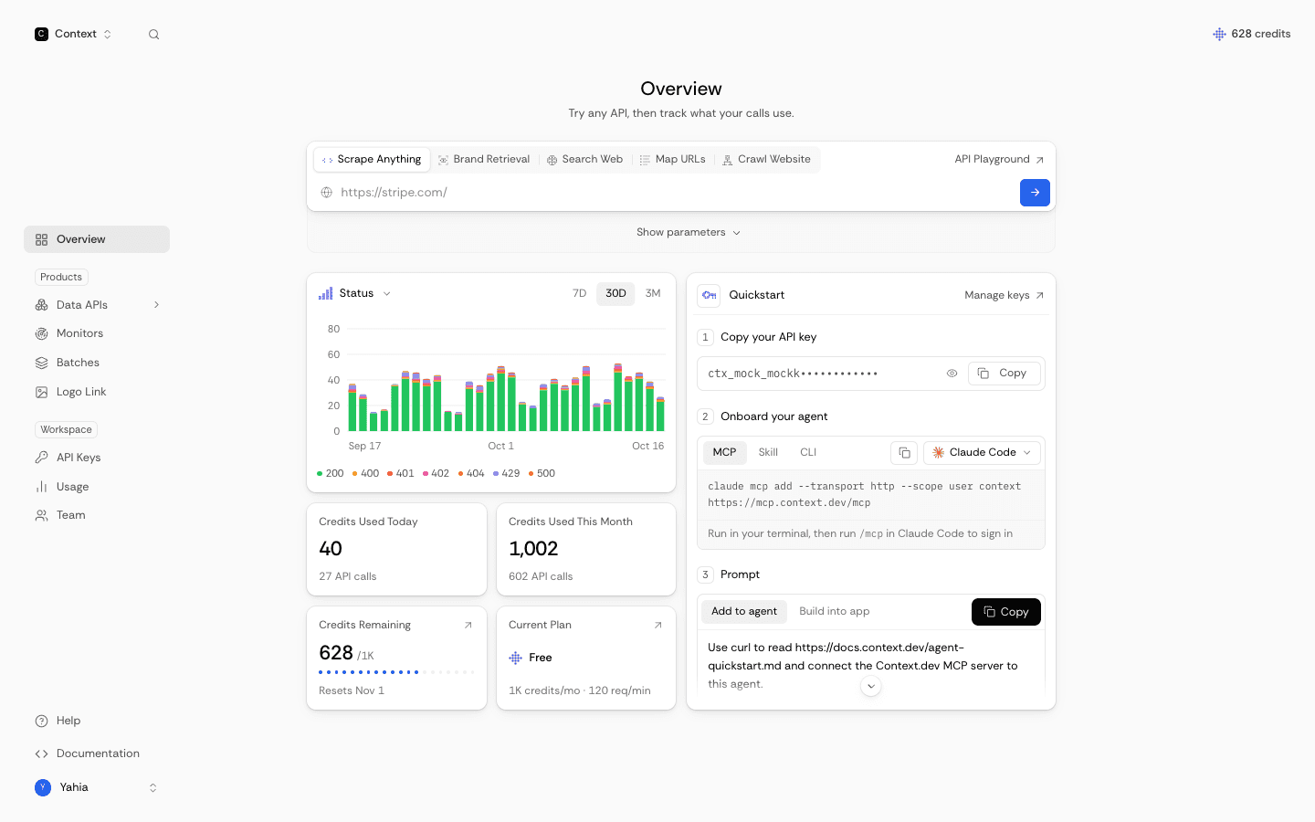
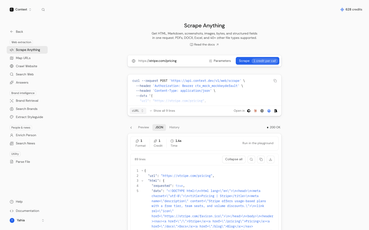
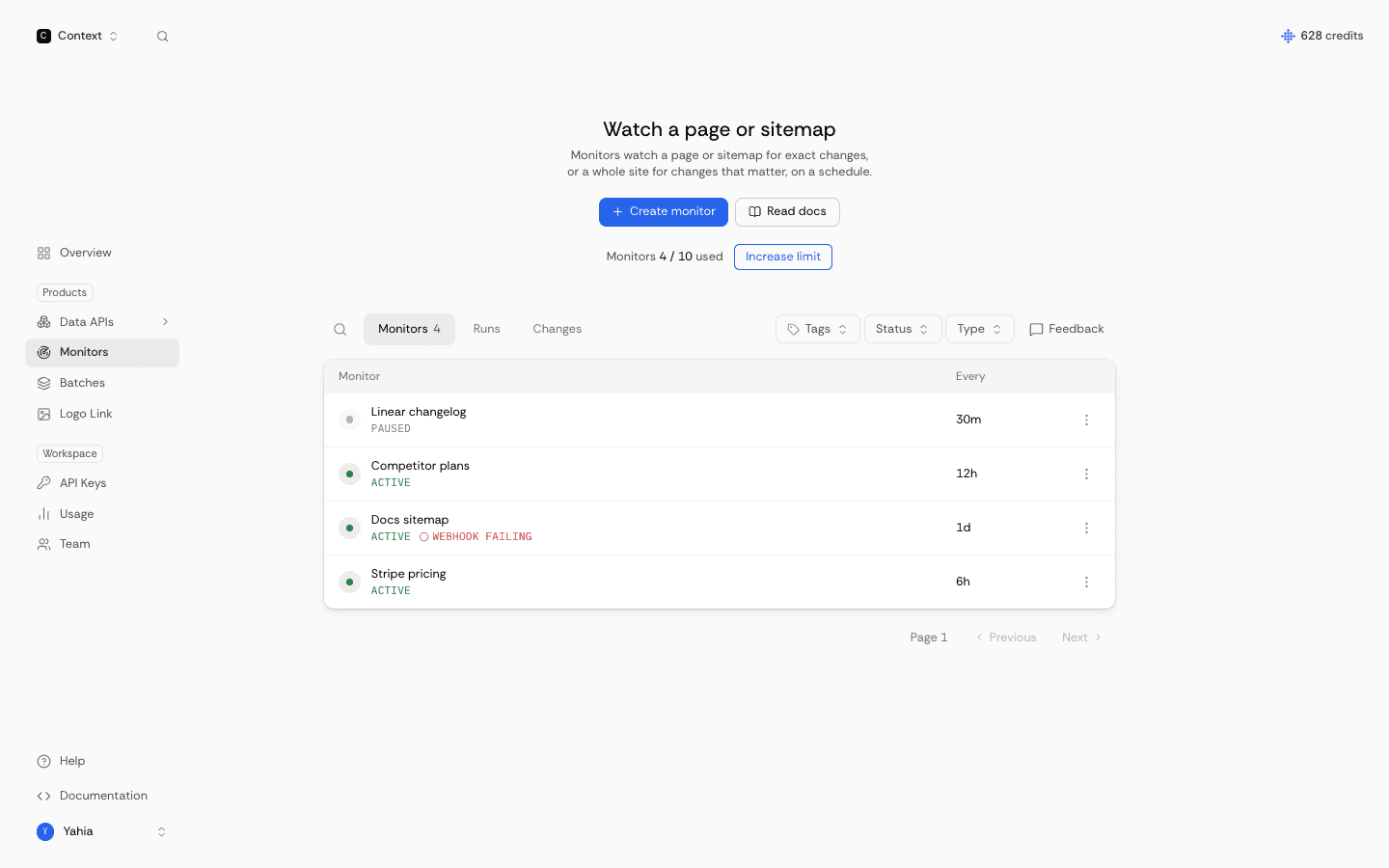
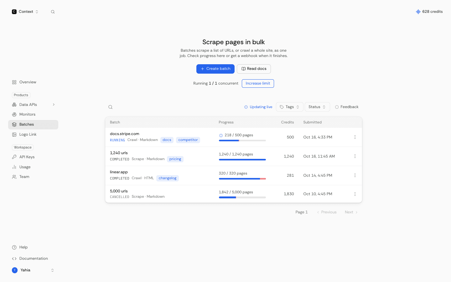
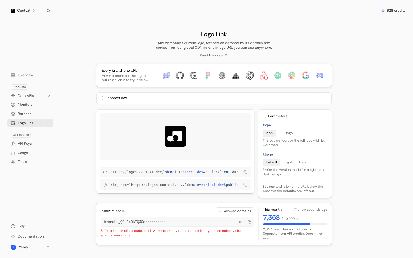
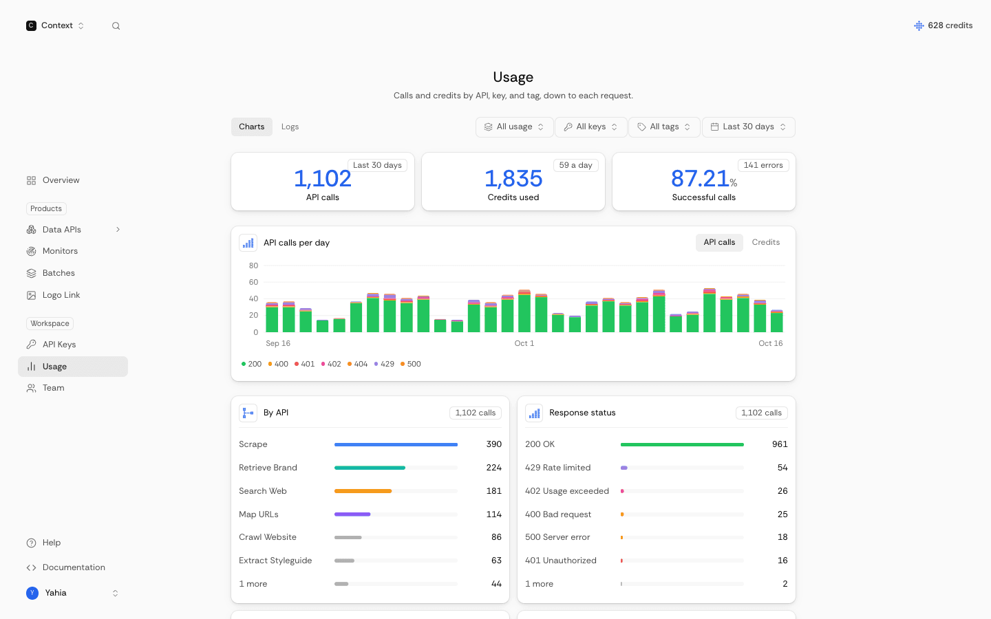
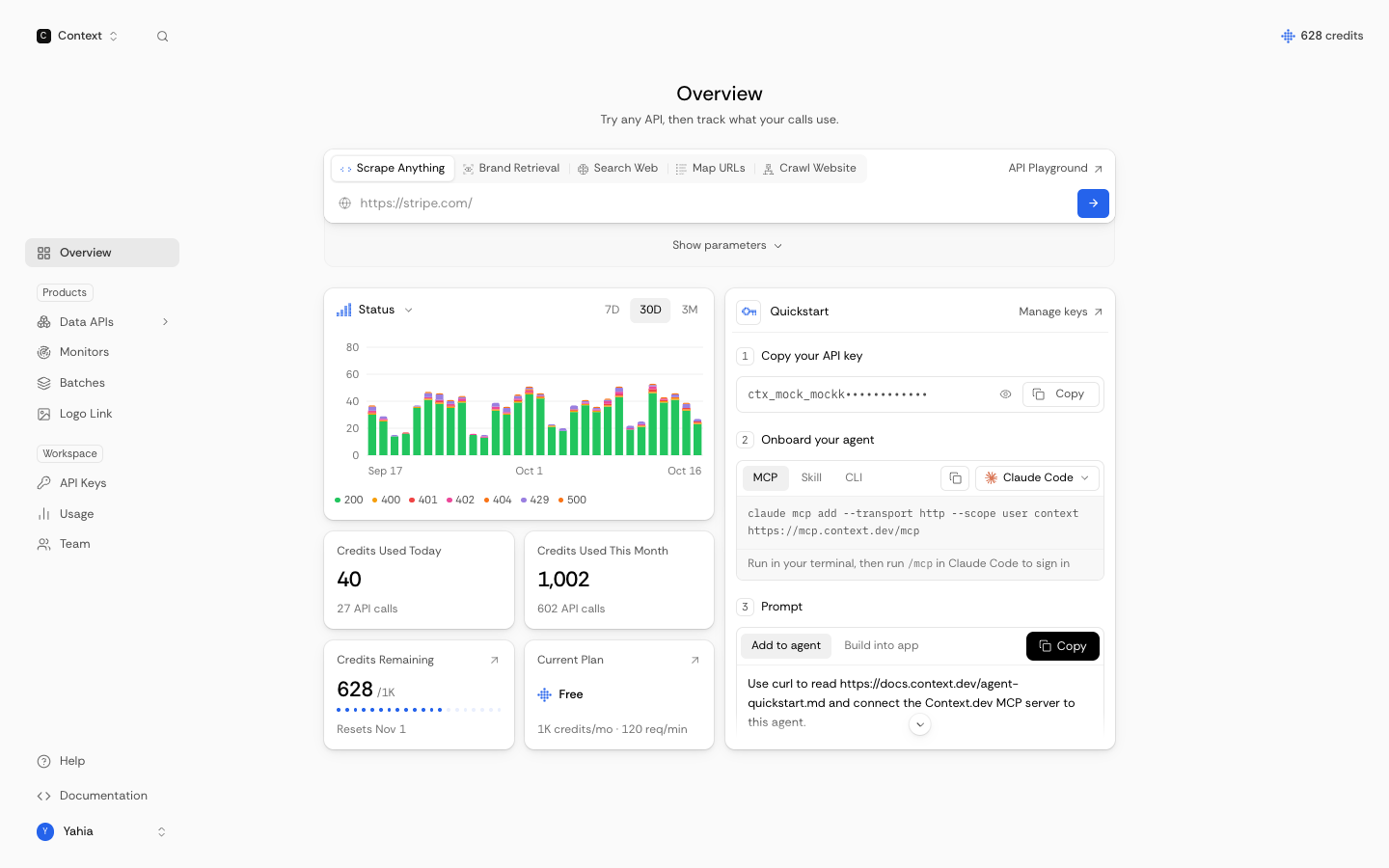
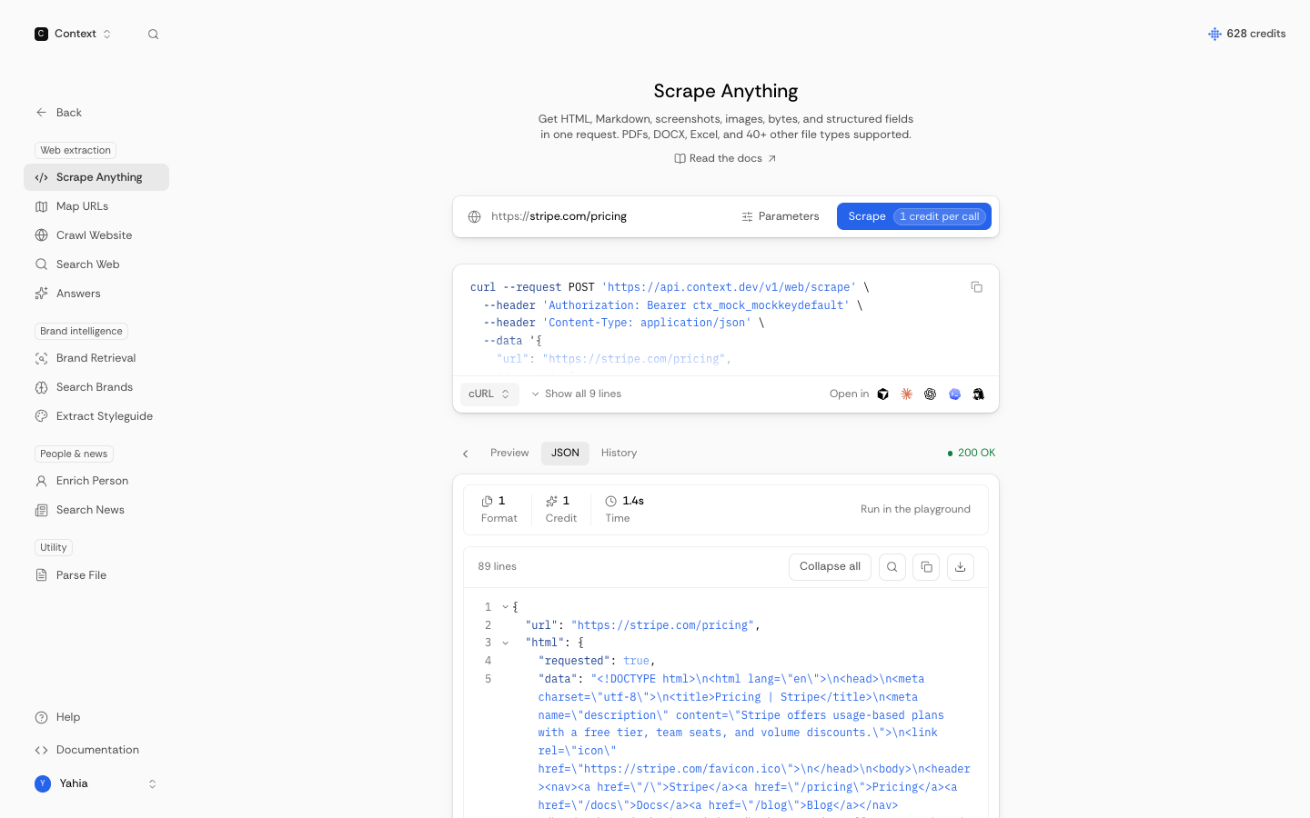
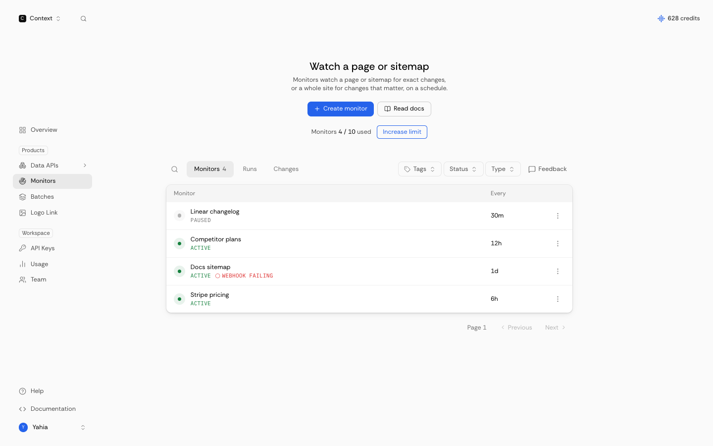
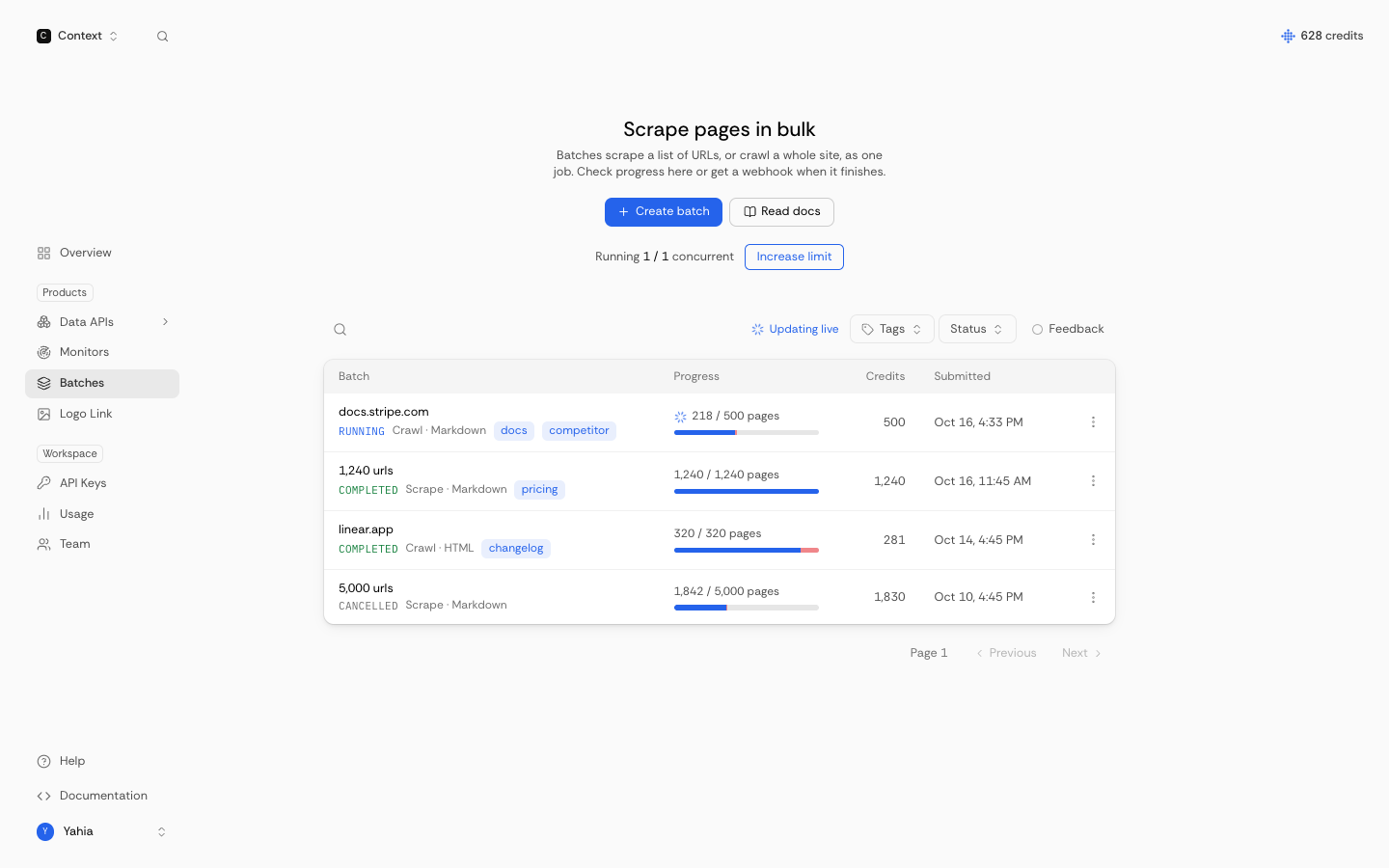
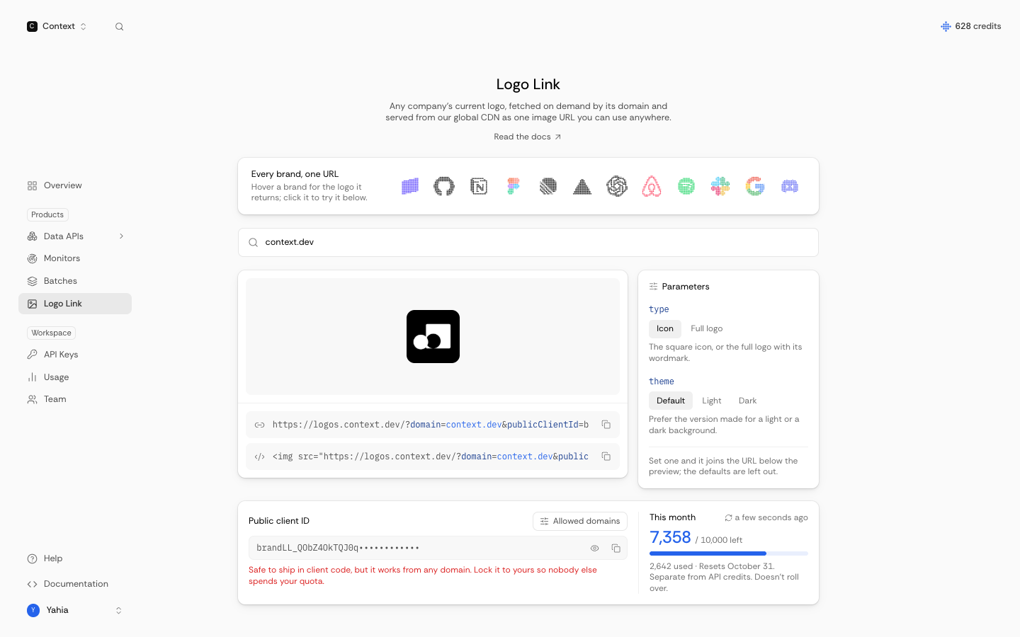
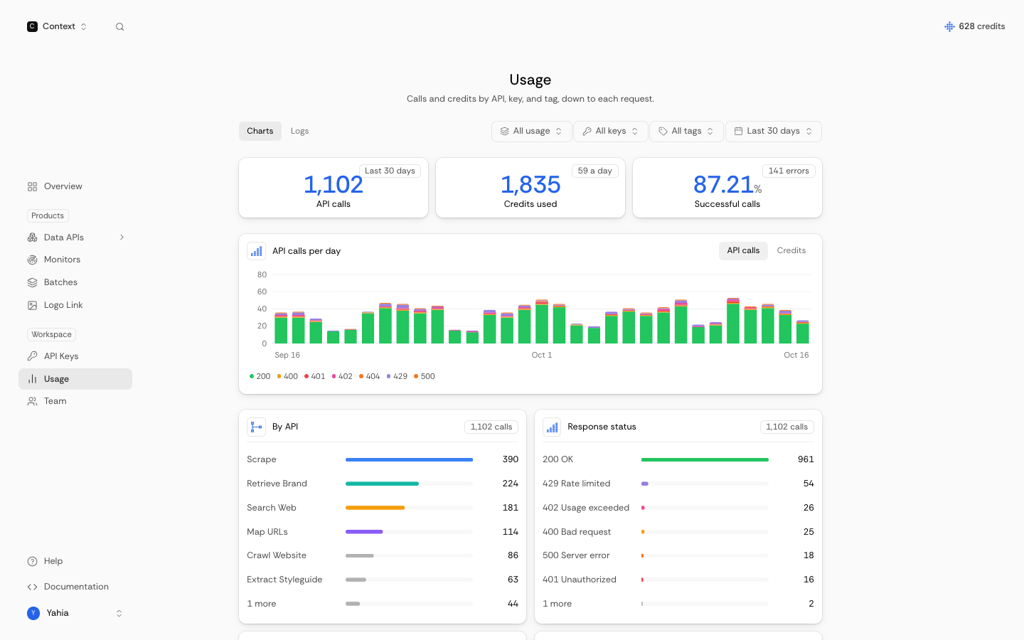
Use these in articles and presentations to show Context.dev in action.