2024 was a heavy year for rebrands. Some were quiet refreshes, a few were full identity overhauls, and at least one was a stunt that worked better than anyone probably expected. Some of these landed. Some didn't. Here's what caught our attention, and why.
(For some industry background, Interbrand's annual brand value study is a decent reference on how these things affect brand equity over time.)
Quick rundown
- Jaguar — dropped the leaping cat, went minimalist, announced it's going all-electric
- 7UP — retro-modern refresh with a neon-tinged logo
- Jell-O — swapped the old script for a clean sans-serif, leaned into playful packaging
- Eurostar — brought back the "star" after merging with Thalys
- Tupperware — new logo that mimics the open/close of a container
- Goldfish — temporarily renamed itself "Chilean Sea Bass" as a bit
- Kit Kat — chunkier, blockier logo that matches the bar
- Bose — cleaner wordmark, a custom typeface, and a lot of high-profile artist partnerships
- Amazon Prime Video — more adaptable visual system, built around the Amazon smile
- WhatsApp — brighter green, cleaner visuals, not a dramatic overhaul
1. Jaguar: the big bet on electric

Jaguar's rebrand was the most divisive of the year. They unveiled the Type 00 concept car in early December, dropped the leaping cat from the logo, and announced the plan to become an all-electric brand by 2025.
The new logo uses an uppercase 'J' and lowercase 'r' in a serifed, somewhat art-deco style. Reactions ran hot — some people loved it, a lot of longtime fans hated it. A lot of the anger was about the pink-heavy launch campaign, which didn't feature a car at all.
What Jaguar seems to be betting on is that they're not trying to win back the existing customer base. They're trying to acquire a different one, and the new identity makes that obvious. Whether that works is a question for 2026, not now.
What changed
- Logo: simplified, stripped down, no more leaping cat
- Brand positioning: "exuberant modernism," whatever that ends up meaning in practice
- Product plan: all-electric by 2025, with the existing lineup (XE, E-Pace, etc.) being phased out
2. 7UP: retro-modern refresh
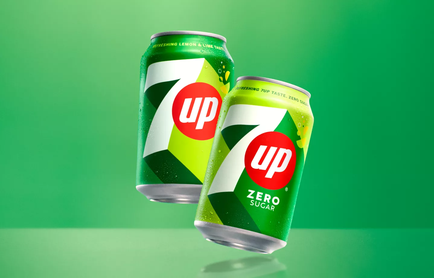
7UP's redesign was much more restrained than Jaguar's, and probably more successful for it. The new look keeps the brand recognizable but pushes the logo into 3D, adds a neon-style treatment, and brightens up the green.
The packaging is cleaner — less crowded, more confident. It sits on a shelf next to Sprite and stands out, which is the main job.
It's a refresh, not a reinvention. Which is what most legacy soda brands actually need.
3. Jell-O: a cleaner look for a familiar product
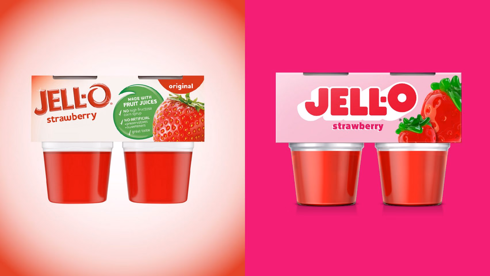
Jell-O swapped out the old script logo for a bold, rounded sans-serif. The packaging now leans into bright colors and playful graphics, which fits where the product actually sits (kids' lunchboxes, nostalgic adults, dessert aisles).
It's a quiet refresh, but the old mark was starting to feel dated next to everything else on the shelf. The new one gives them more flexibility on packaging and social. If you grew up with Jell-O, you'll still recognize it. If you didn't, you might actually notice it now.
4. Eurostar: one brand after the Thalys merger
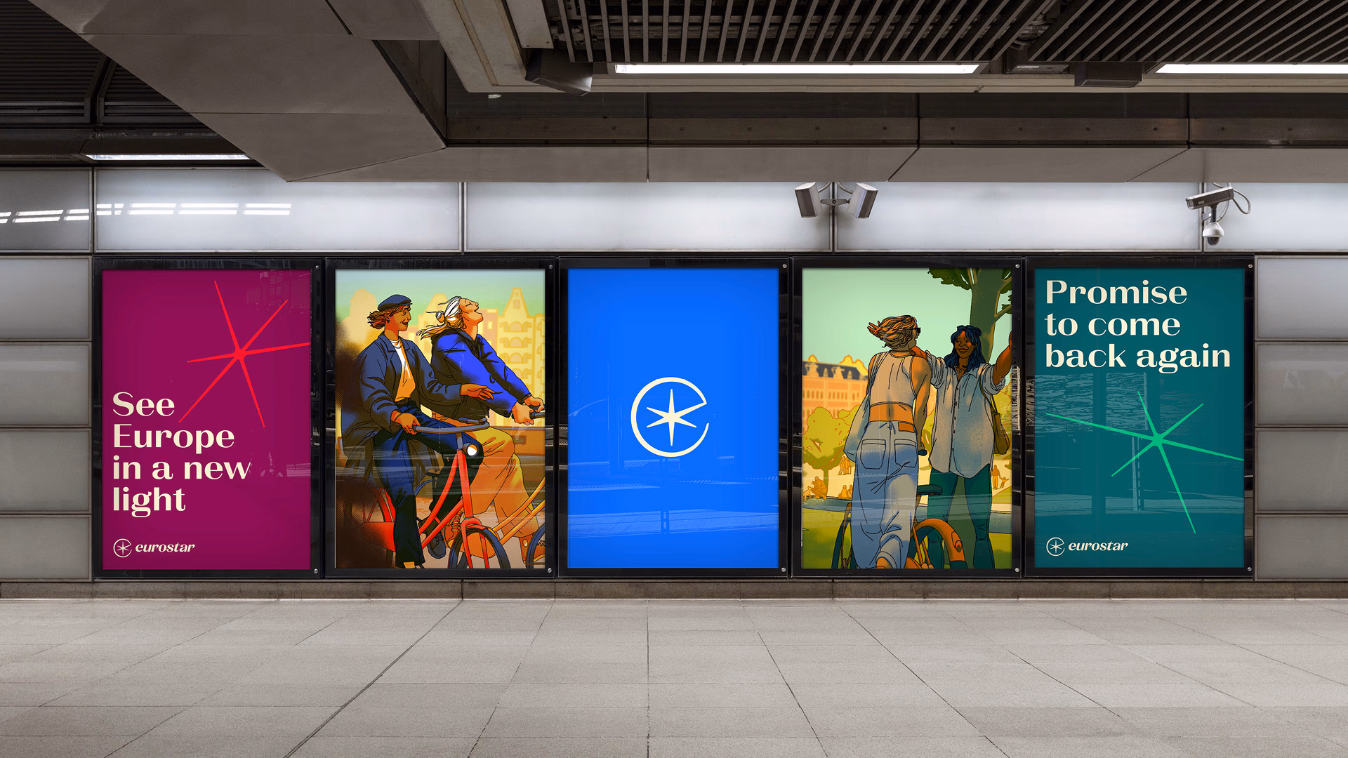
Eurostar merged with Thalys in 2022. The rebrand, unveiled in 2023 and rolling out through 2024, pulls those two identities under one name. DesignStudio did the work, and the new logo pulls the "star" back into the mark.
Starting November 4, 2024, the travel classes get simpler — Standard Premier becomes Plus, which is less confusing and easier to explain. The company is aiming to double annual passenger volume to 30 million by 2030, which is ambitious for a rail operator post-COVID.
The rebrand itself is clean, but the real test is operational: can the merged service actually feel like one brand to a passenger booking London to Amsterdam? That's where the identity work pays off or doesn't.
5. Tupperware: a new logo that moves
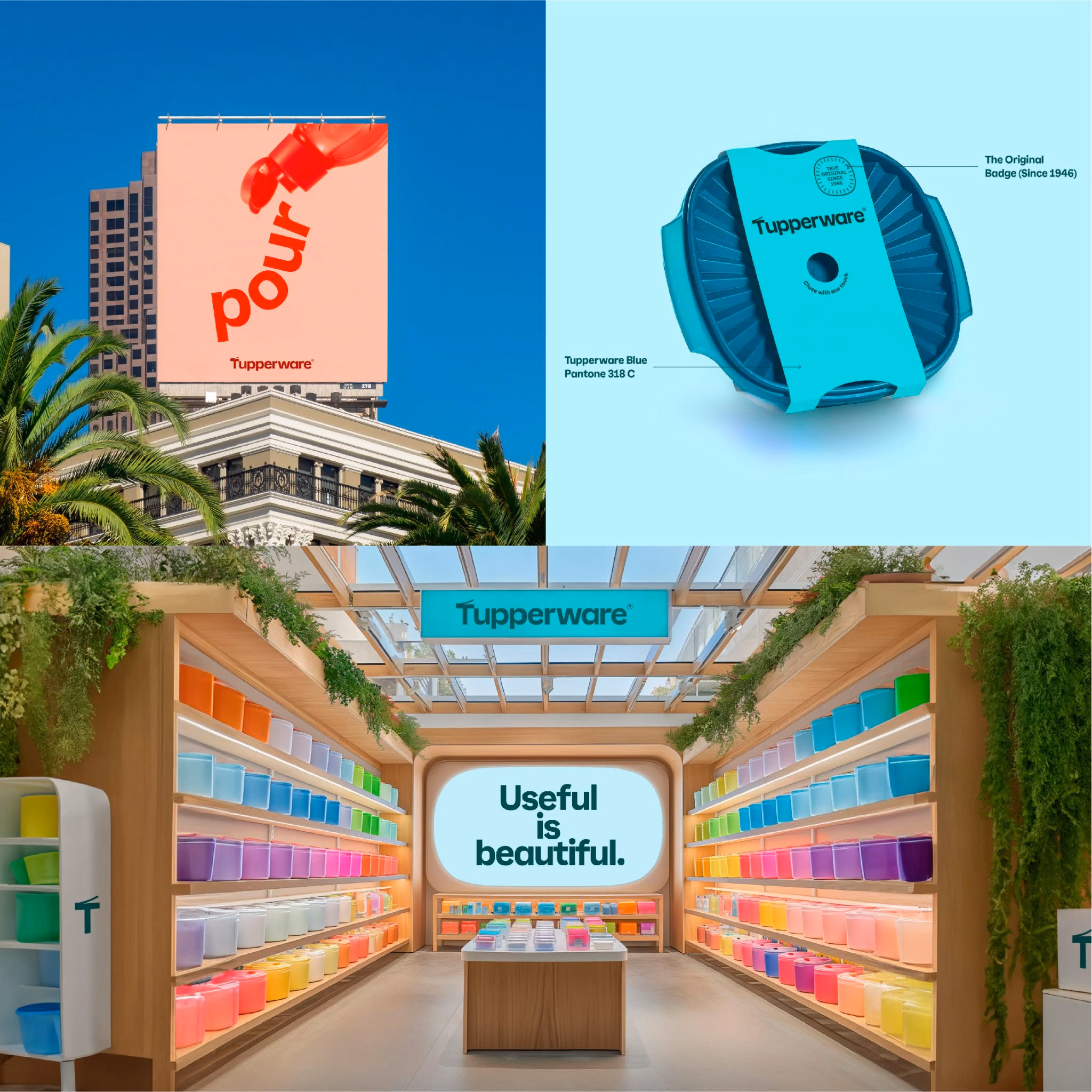
Tupperware's rebrand came with a sharp new tagline — "Useful is Beautiful" — and a logo that cleverly suggests the open-and-close motion of an actual Tupperware container. It's a small bit of design cleverness that pays off every time you look at it.
The typography and graphic system are built around the shapes of the products, which gives the visual identity real coherence. It's the kind of thinking that usually gets called "systems design" in agency decks and actually shows up in practice.
The rebrand landed during a rough period for the company, with a transaction set to close by end of October 2024. The identity work won't fix the business problems on its own, but it's one of the stronger design efforts of the year on its own terms.
6. Goldfish: the "Chilean Sea Bass" stunt
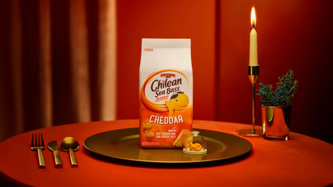
This is the one. Goldfish, the cracker brand, temporarily renamed itself "Chilean Sea Bass" to appeal to adults. That's it. That's the bit.
The thinking wasn't totally arbitrary — over half of Goldfish's consumers are adults, and the brand's been saddled with a "kids' snack" reputation for decades. So the creative agency Mischief @ No Fixed Address pitched the most absurd possible solution: a fancy fish name, played completely straight.
It generated more than 3,000 media stories, and almost all of them mentioned Goldfish by name. That's the tell — the whole point of the stunt was to get people saying "Goldfish" while pretending to say "Chilean Sea Bass." It worked because it was funny, and because the brand was willing to commit to the joke all the way through (including a collab with the Dude With Sign Instagram account).
What made it work
- It was actually funny, not just brand-trying-to-be-funny
- Adults are most of the customer base, so the repositioning wasn't cynical
- Media loved it because the story is easy to tell
- The brand name came through in every headline
7. Kit Kat: the logo got chunkier
Kit Kat's new logo is thicker, flatter, and more geometric. The old curved, shadowed letters are gone. Sterling Brands did the work, mainly for the U.S. market (Hershey manages the brand there).
It's the right call. The bar itself is chunky and straight-edged — it has always been a weird match for that swoopy, shadowed wordmark. The new logo looks like the product. That's usually a good sign.
8. Bose: the 60-year-old brand updates for its anniversary
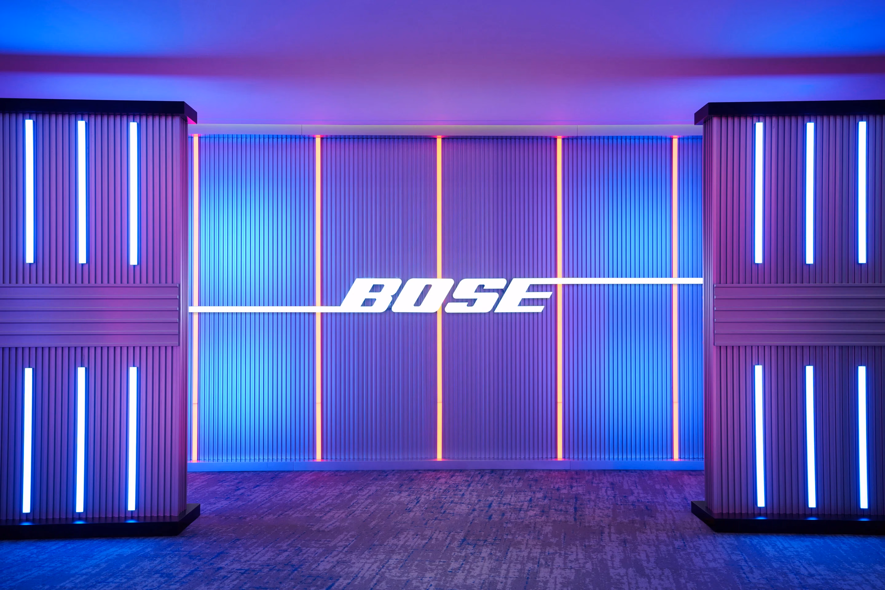
Bose is turning 60 in 2024, and the rebrand (by Collins) is their move to not feel like a legacy audio company. The wordmark is preserved but cleaned up, the type system is new, and the color palette has a lot more life in it than the old silver-and-black minimalism.
The partnership side got interesting too — collabs with Donald Glover and Ice Spice, which are the kind of choices you make when you want younger consumers to see you as a present-tense brand, not their dad's speakers.
The open question is whether the brand experience catches up to the identity. Sonos has spent the last decade eating into the exact customer Bose now wants. The rebrand is a reasonable first move, but it's just that — a first move.
9. Amazon Prime Video: a more flexible visual system
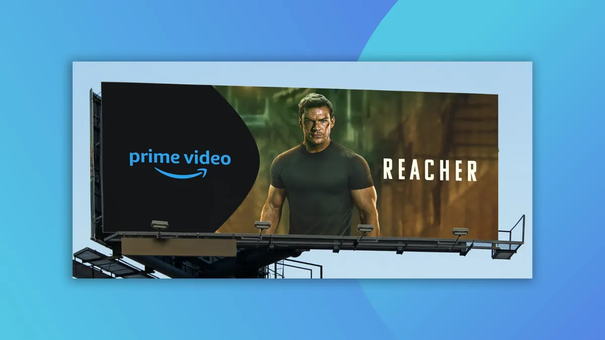
This one's subtle. Prime Video's rebrand is less a new look and more a new system — the visual identity can now stretch across different kinds of content (prestige drama vs. a niche documentary vs. a sports broadcast) without looking inconsistent.
They pulled the "dimple" from the Amazon smile and used it as a design element across the whole identity, which ties Prime Video back to the parent brand without being heavy-handed.
The Freevee content integration also got folded into Prime Video around the same time, which made the rebrand land at a useful moment — a cleaner-looking service at the same moment the library got bigger.
10. WhatsApp: a quiet refresh
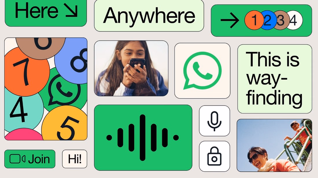
WhatsApp's rebrand is the least dramatic on this list. The green got brighter, the visuals got cleaner, the app experience and the marketing materials line up better than they used to. That's it.
This is probably the right move for a product that a billion-plus people use every day. A dramatic overhaul would've confused everyone. A quiet tightening keeps the brand fresh without breaking what works.
One non-design note: starting January 1, 2025, WhatsApp is dropping support for a handful of older Android devices. That's a business decision, not a branding one, but it's worth knowing if you build on the platform.
What to take from all this
The rebrands that worked in 2024 (7UP, Tupperware, Kit Kat, Prime Video, WhatsApp) mostly followed the same pattern: cleaner, more coherent, better-matched to the actual product. The ones that got the most attention (Jaguar, Goldfish) took real risks, and one of those will be studied in marketing classes for the next decade regardless of whether it works commercially.
The expensive lesson here is that "bold" and "good" aren't the same thing. Jaguar made a bold choice. Whether it's a good one is a question we'll answer a few years from now, probably in a piece about the 10 most interesting rebrands of 2027.